Decentriq is a data collaboration platform that enables teams to analyze sensitive data in secure environments.
The product was powerful but complex, users struggled to understand key concepts and complete core workflows efficiently, leading to slow onboarding and friction in daily use.
The platform dealt with abstract privacy concepts that were difficult for users to understand. I introduced clearer mental models, simplified workflows, and designed guided interactions that reduced onboarding time and improved usability.
The platform offered powerful capabilities, but core workflows were difficult to understand and navigate, especially for non-technical users.
Users struggled with:
- Abstract concepts such as datasets, clean rooms, and queries
- Fragmented workflows across multiple sections
- Repetitive and unclear steps to complete key tasks
- This led to slow onboarding, confusion, and inefficiencies in daily usage.
- Led design of key product workflows end-to-end
- Collaborated closely with product managers, engineers, and data stakeholders
- Translated complex technical requirements into intuitive user experiences
Understanding user needs
I talked to users to find out where they were getting stuck and what was causing them trouble.
Mapping complexity
I reviewed existing workflows to identify unnecessary steps and areas causing user frustration.
Simplifying workflows
I streamlined the main processes to make them more intuitive, combining steps where possible and providing clear guidance throughout.
Iterating with feedback
We tested the solutions with users, making adjustments based on their feedback and data insights.
- Consolidated fragmented workflows into guided, step-by-step experiences.
- Reduced the number of actions required to complete key tasks.
- Improved information hierarchy to make complex concepts easier to understand.
- Designed clearer navigation across data-heavy interfaces.
- Contributed to more consistent UX patterns across the product.
For instance, the process of establishing a new clean room was previously cumbersome and prone to user drop-off. I restructured this into a streamlined, guided sequence that enhanced comprehension and completion rates.
By streamlining the process to include data upload, partner selection, and configuration adjustments, we significantly enhanced user retention rates.
- Reduced task completion time by ~20–30% for key workflows
- Improved onboarding experience and reduced user confusion
- Enabled users to complete complex tasks with greater confidence and efficiency
As the product and engineering team grew, maintaining consistency became increasingly important.
- Created reusable components and design patterns, both on Figma and React.
- Helped align design decisions across teams
This improved development speed and ensured a more cohesive user experience.


Branding · Motion design · Web design
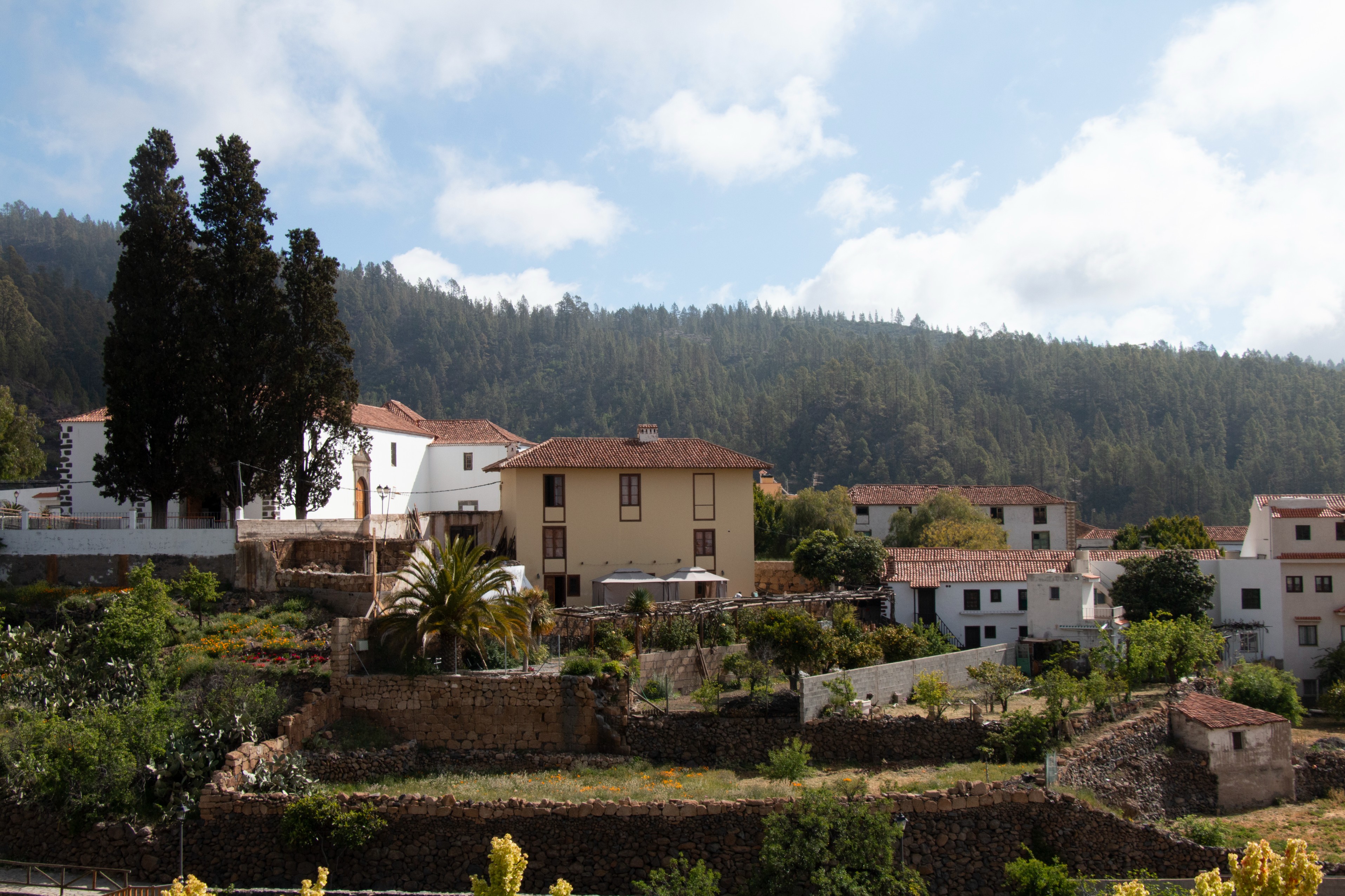
A new petit-hotel in the quiet village of Vilaflor de Chasna in Spain, needed a full visual identity, website, and promotional launch material. With no existing brand references and a very limited timeframe, the goal was to create a distinctive identity that would stand out in the rural tourism market while feeling true to the local environment.

I began with research into the region’s architecture, colours, natural textures, and the warm atmosphere of the volcanic landscape. From this, I developed a minimal and welcoming brand system that the hotel could use both online and across physical touchpoints such as signage and menus.
.png)
graphic design
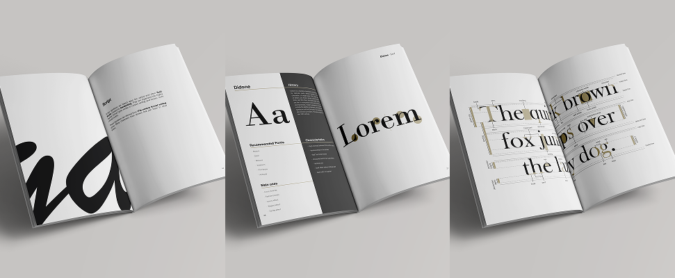
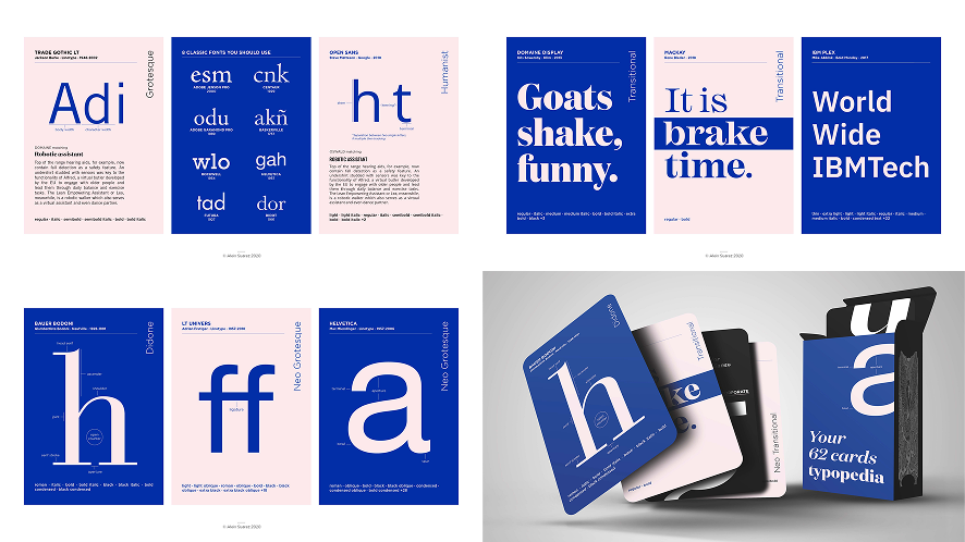
typography · editorial design · graphic design
Motion design